Nineteen 53
John Fowler manages thirteen holiday parks on the west coast, the new sports bar Nineteen 53 would appeal to families, feel premium and have built-in authenticity, whilst celebrating the heritage of the John Fowler brand, with a view to roll out across all parks. Unmistakably full of history the Nineteen 53 story captures it’s humble beginnings and ‘alternative determined’ spirit. The pattern design is informed by the graphical language of the sports shirt, including the ubiquitous vertical stripes, paired with a typography that has its roots in the mid 20th century, crafted with uniquely designed serifs that elevates the retro feel and makes this distinctly nostalgic.
You may also like
NEA
2021
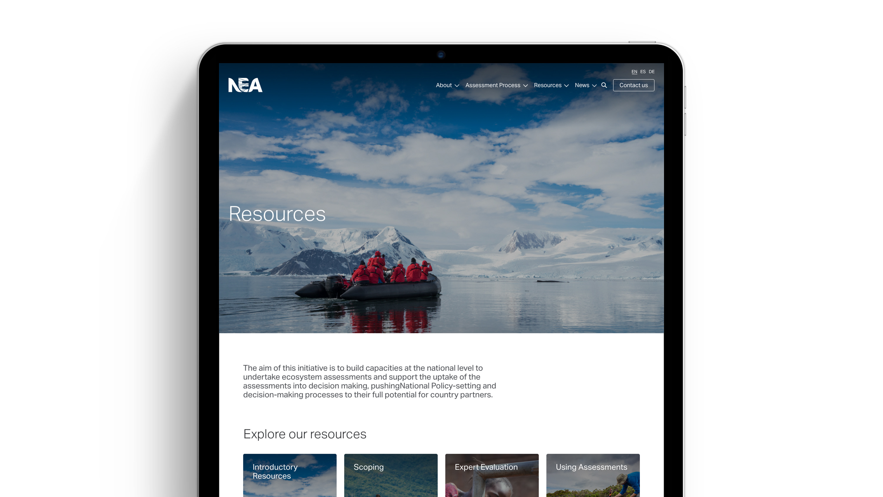
Meeting the needs of those conducting for National Ecosystem Assessments (NEAs) around the world by facilitating access to years of tools, resources and networks to support practitioners, this WordPress build aims to provide greater support through in-depth guidance and promote NEA as the authority it rightly is.
A series of typographic installations (FMP)
2014
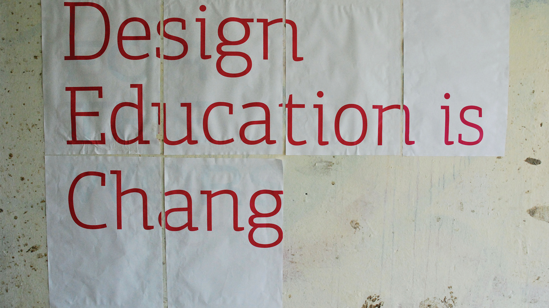
I produced a series of typographic installations sited in rural and urban environments, for my Final Major Project, expressing that reforms to design education would have affected everyone. The key subject of the installations was change. Over time the typographic statement would alter, either through natural processes or by myself adding to it, I documented the installations through a series of photographic images.
One example saw me use the sun to project a typographic message, as the position of the sun changed so did the type. The type would become more and less obscure as the sun changed position. Due to the success of the project I was invited to present my project to visiting students from North America.
FMCG samples
2020
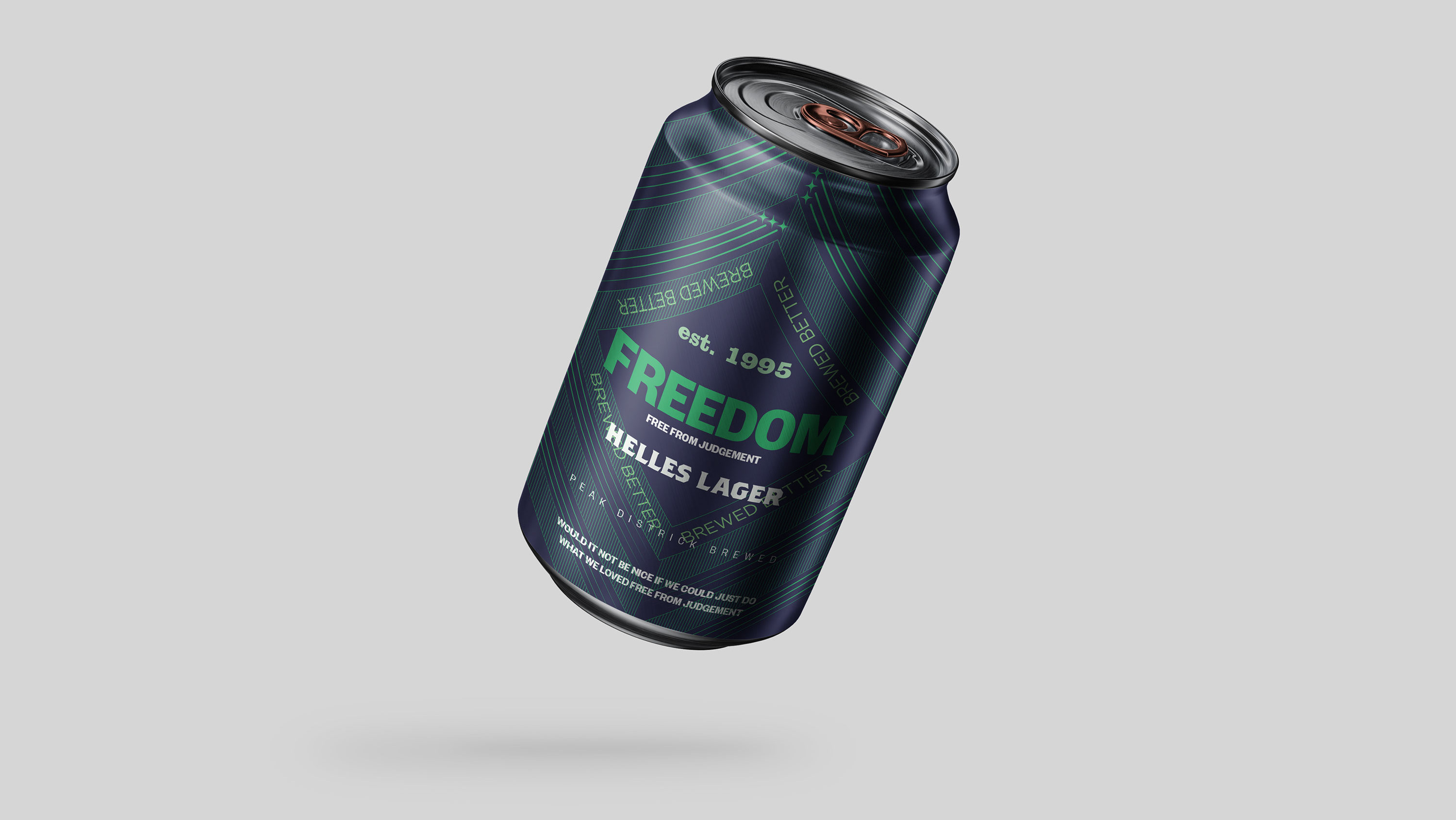
Sold nationwide and known as the original craft beer Freedom wanted to reposition itself, to sit between the craft and premium international beer categories. The design and brand is intended to feel authentic with its use of intricate pattern design paired with bold language, geographic reference and date of establishment. Retaining the essence of the six pointed star through its tessellating negative space, the design is modern whilst purposefully authentic, defining its personality.
Sustainability Assessment Tool
2020
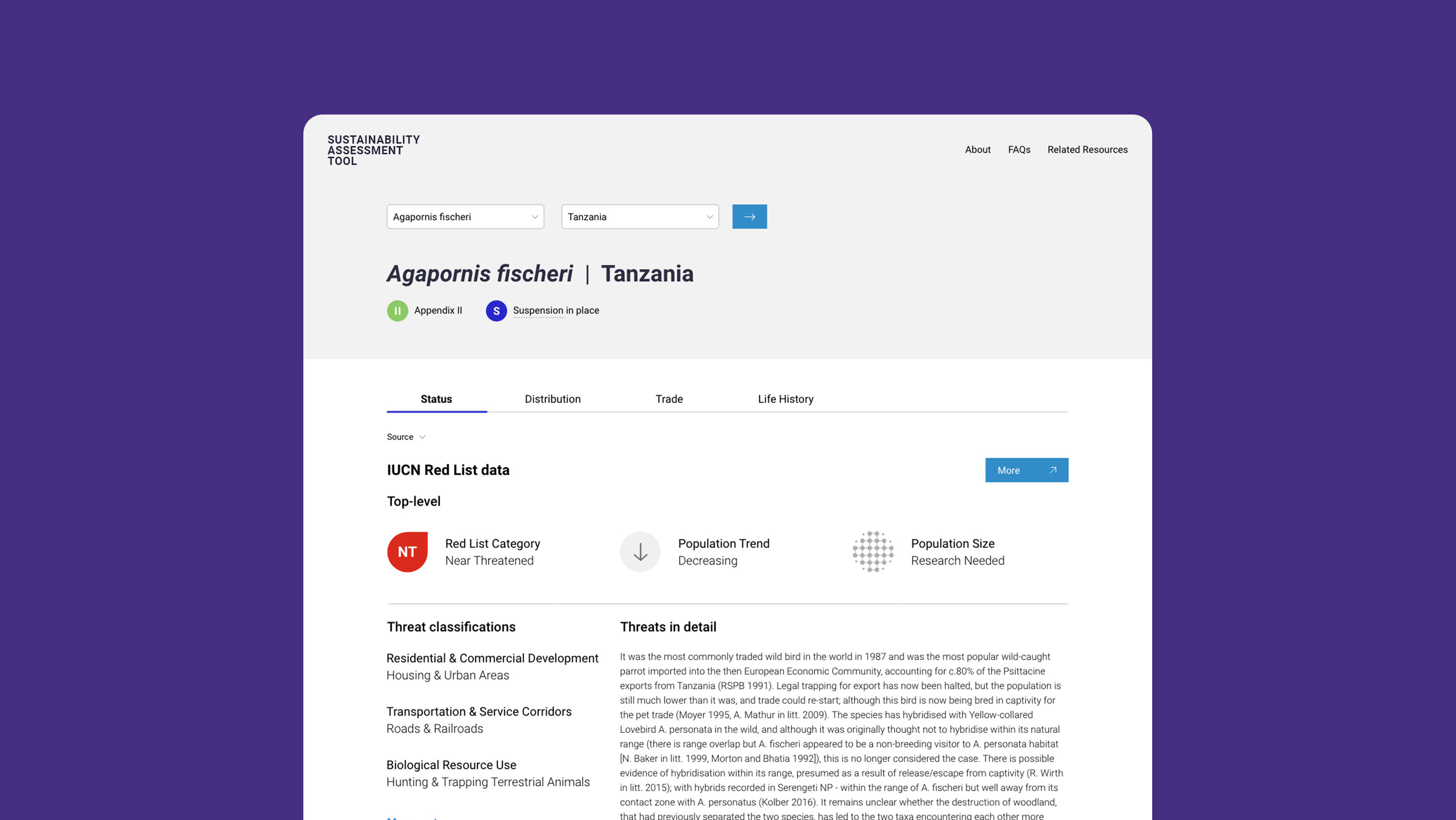
Sustainability Assessment Tool brings together Non-Detriment Finding (NDF) information for CITES parties that underpins decisions made on exporting wild-sourced specimens of plants and animals and supports that any such trade would not be detrimental to a species' survival.
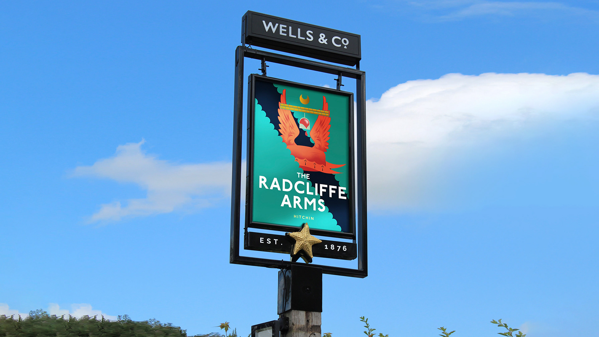
Charles Wells Pub Pictorials
2020
Simple, surreal and eclectic illustrations draw on the character and geography of each pub, bringing light to its history and in some cases heraldry through gastronomic informed pub pictorials. Delivered across the Charles Wells line of nationwide pubs, the design architecture is designed for typographic consistency to crate a familiarity across the chain.

Calvert 22 Gallery Illustrations
2014
Commissioned to illustrate city maps for London art gallery, illustrations were published within Calvert 22’s journal on Russian and Eastern European culture.
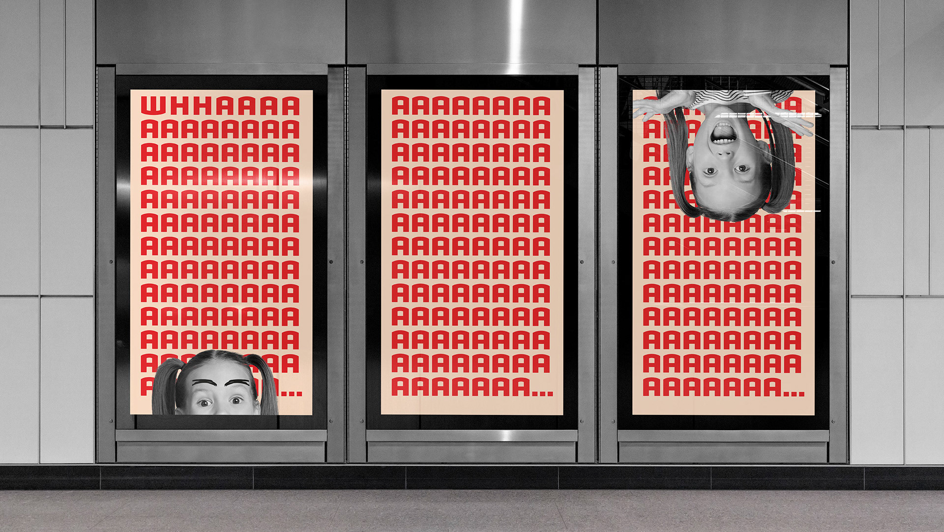
Charles Wells Multi-Channel Campaign
2020
Charles Wells is known for creating memorable experiences across their pubs nationwide, they needed an arresting campaign to promote their Summer Kids Eat Free promotion. Loud, bold and statement making the concept is designed to make you look twice. Purposefully unpolished the design features sharp colours and key characters ‘amazed by the offer’, much like the top message they cannot help but say ‘whaaaa’.

T.W.W
2020
The Wood Works, a bespoke furniture producer, had an outdated website that was harming their brand name, they desperately needed a website that could communicate their narrative more effectively. I re-designed the website (whilst working for CDA), it features a stripped back design with strong imagery, the brand and wordmarks hold onto an authentic narrative
with the use of timeless transitional type.

Mabadiliko
2020
Madadiliko works with black communities to build resistance and push forward equitable policies, as well as this they also work with corporate clients to confront exclusive behaviours and teach cultural humility. I’ve worked with Mabadiliko in the second half of 2020 on a pro-bono basis to enhance their visual and verbal brand offering.
Editorial samples
2015
