InView Magazine
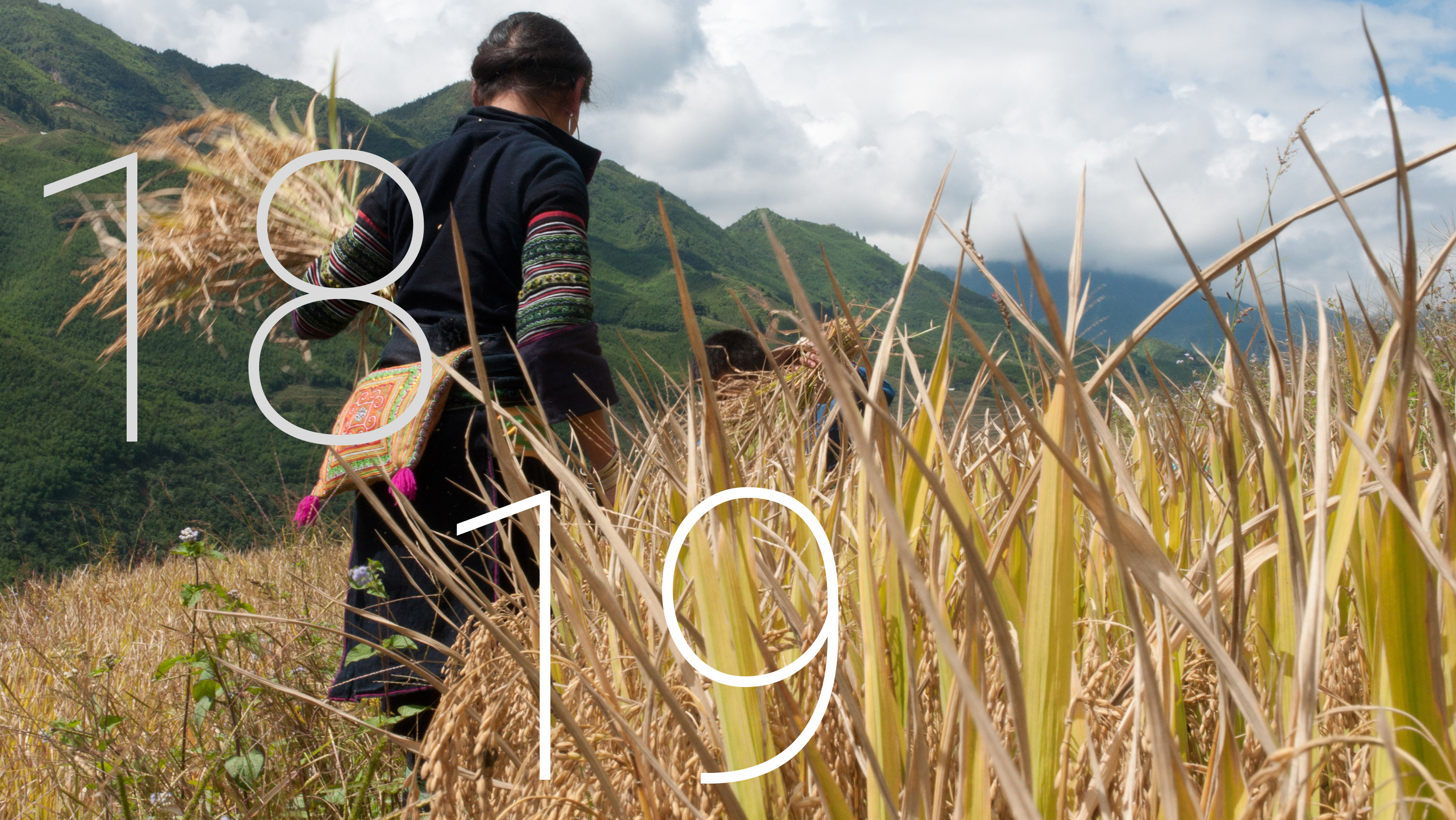
InView was a quarterly printed update for Kingdom Creative, a video production agency that specialised in commercial film, the magazine was sent to Kingdom’s large mailing list that included the likes of Porsche GB, MINI, Volkswagen and Silverstone.
The magazine was designed to be read in thirty seconds, therefore content was minimal. I managed each issue from the start and therefore was involved in designing the layout and choosing content.
D.E.C Exhibition booklet (FMP)
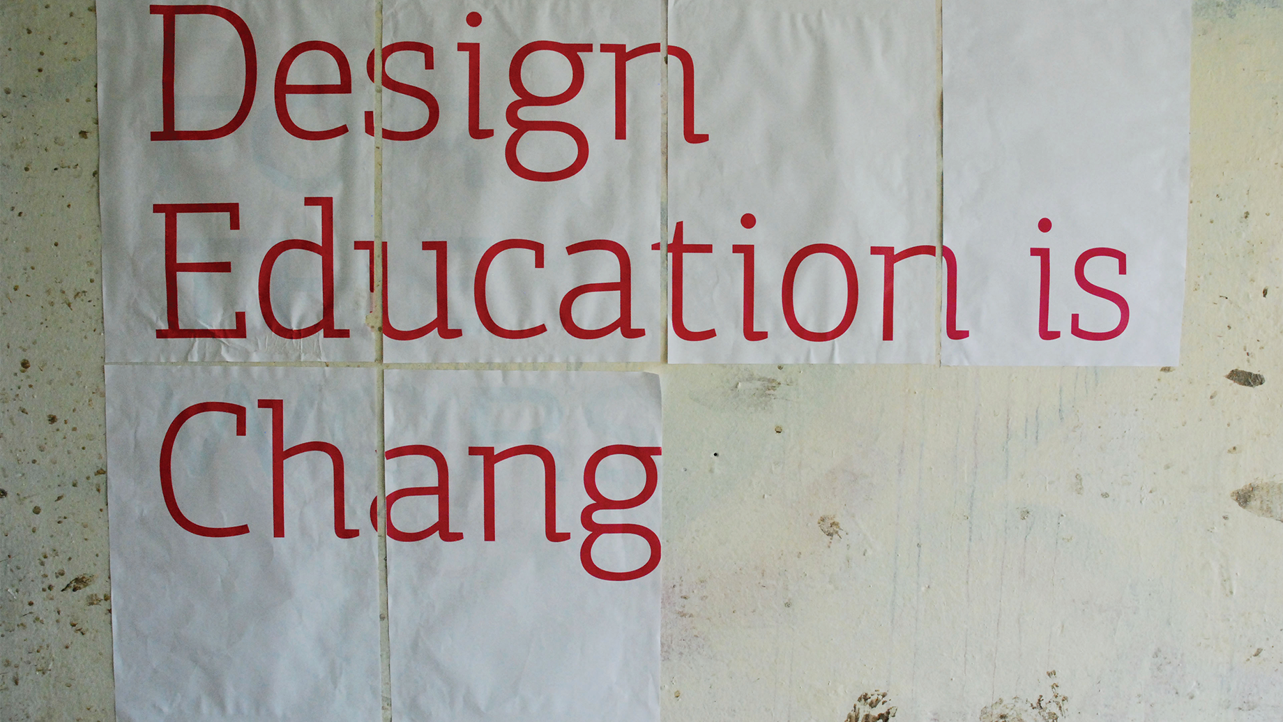
As part of my Final Major Project I also designed a booklet that informed visitors, to the end-of-year degree show, the meaning behind the installations and what the proposed changes would mean for the future of design education.

You may also like

Mabadiliko
2020
Madadiliko works with black communities to build resistance and push forward equitable policies, as well as this they also work with corporate clients to confront exclusive behaviours and teach cultural humility. I’ve worked with Mabadiliko in the second half of 2020 on a pro-bono basis to enhance their visual and verbal brand offering.
NEA
2021
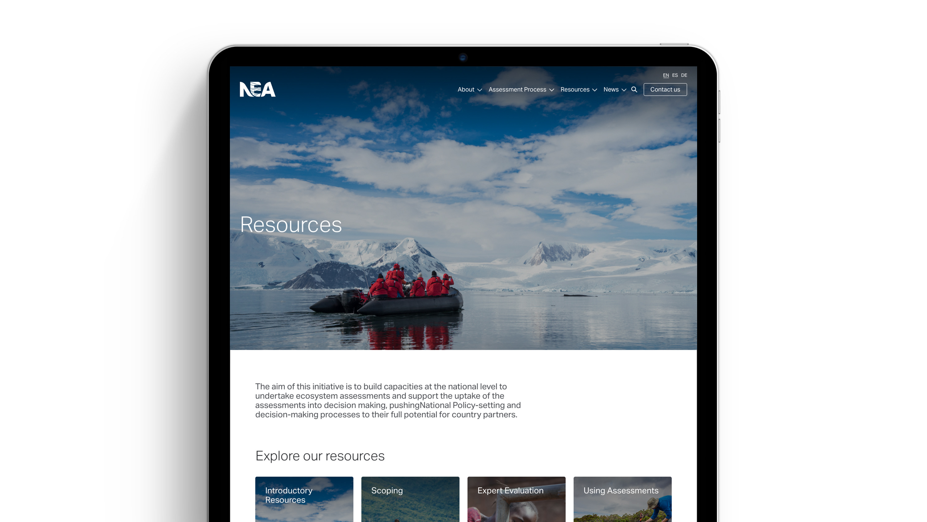
Meeting the needs of those conducting for National Ecosystem Assessments (NEAs) around the world by facilitating access to years of tools, resources and networks to support practitioners, this WordPress build aims to provide greater support through in-depth guidance and promote NEA as the authority it rightly is.
UNEP-WCMC Annual Review
2020
The annual review was assigned a reduced page count, in an effort to reduce forest loss most of the content was made digital, this meant printed content had to engage with the reader and entice them to visit online. Using a unconventional folded format the user is able to interact with the design, call-to-actions to the digital version are made prominent and content is restrained to encourage conversions to the online version.
A series of typographic installations (FMP)
2014
I produced a series of typographic installations sited in rural and urban environments, for my Final Major Project, expressing that reforms to design education would have affected everyone. The key subject of the installations was change. Over time the typographic statement would alter, either through natural processes or by myself adding to it, I documented the installations through a series of photographic images. One example saw me use the sun to project a typographic message, as the position of the sun changed so did the type. The type would become more and less obscure as the sun changed position. Due to the success of the project I was invited to present my project to visiting students from North America.
HARRY'S
2020
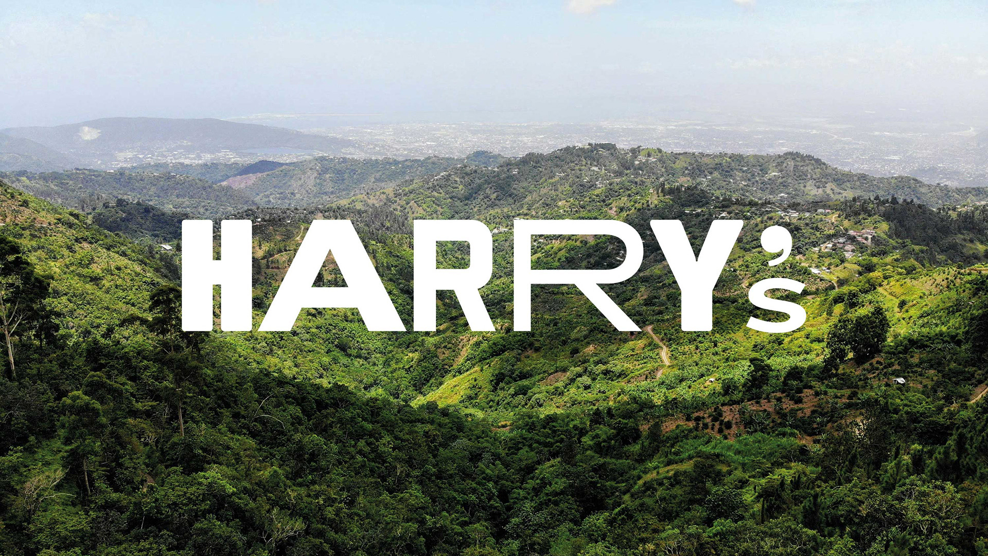
Pushing the boundaries of what an independent school eatery can be, HARRY’s allows students to taste the colour through vibrant tones inspired by the far flung flavours that many are used to exploring in their downtime. At it’s heart the identity is high-street inspired, playful and experimental with an arresting typographic motif, a nod to the bold and experimental flavours on offer.
Nineteen 53
2020
John Fowler manages thirteen holiday parks on the west coast, the new sports bar Nineteen 53 would appeal to families, feel premium and have built-in authenticity, whilst celebrating the heritage of the John Fowler brand, with a view to roll out across all parks. Unmistakably full of history the Nineteen 53 story captures it’s humble beginnings and ‘alternative determined’ spirit. The pattern design is informed by the graphical language of the sports shirt, including the ubiquitous vertical stripes, paired with a typography that has its roots in the mid 20th century, crafted with uniquely designed serifs that elevates the retro feel and makes this distinctly nostalgic.
Siemens Brand
2020
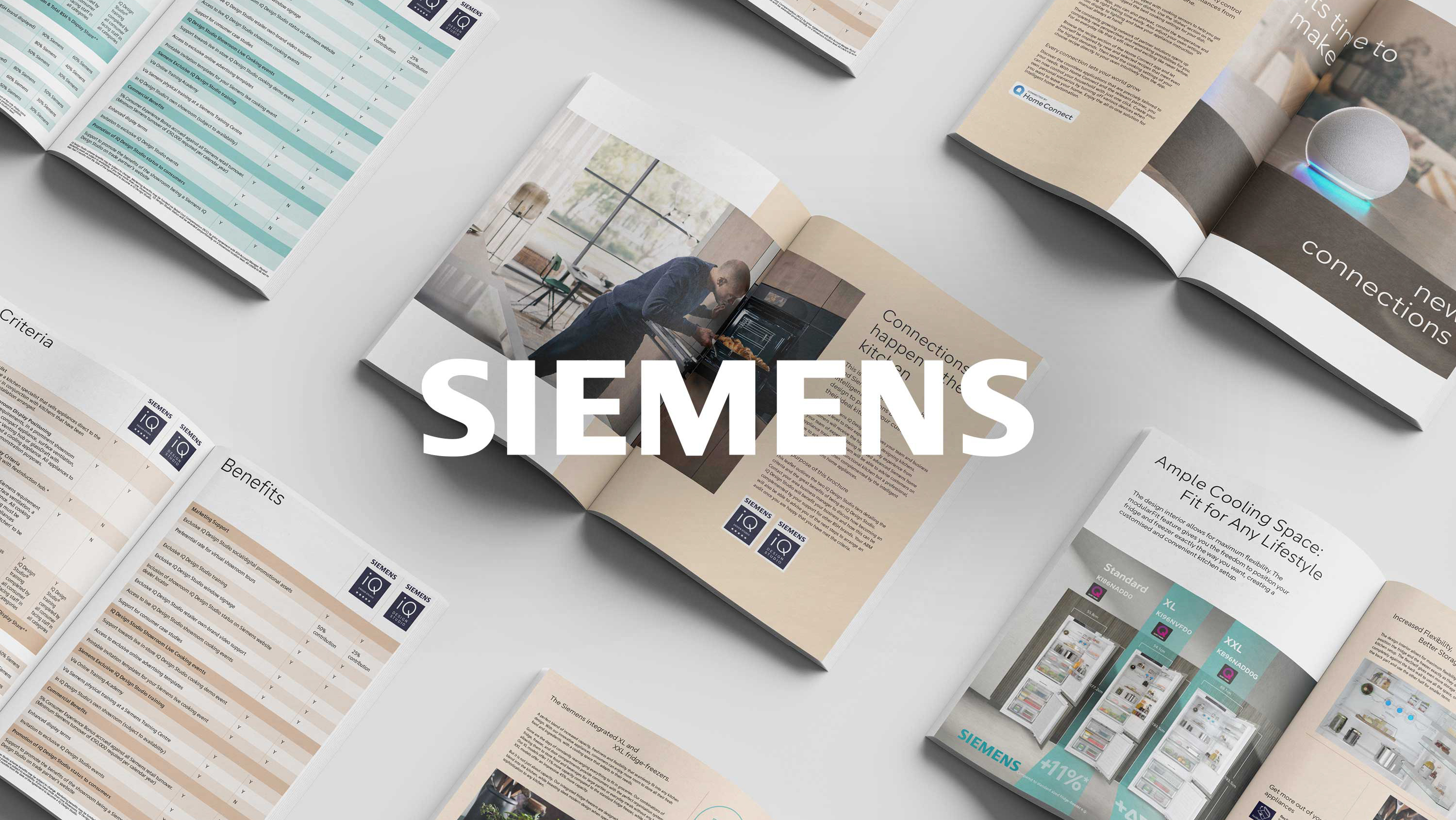
Working as a Creative lead on design outputs for Siemens Home Appliances’ UK & Ireland division–strategically positioning and launching new product ranges as well as running lines across all mediums. The projects links motion, social and digital, print, POS, exhibition plus all the tools for retailers to drive sales in store.
Calvert 22 Gallery Illustrations
2014
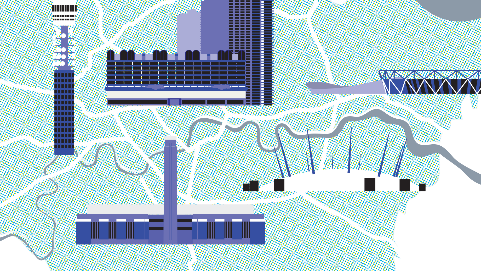
Commissioned to illustrate city maps for London art gallery, illustrations were published within Calvert 22’s journal on Russian and Eastern European culture.
Charles Wells Pub Pictorials
2020
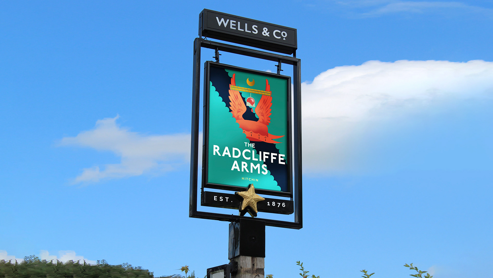
Simple, surreal and eclectic illustrations draw on the character and geography of each pub, bringing light to its history and in some cases heraldry through gastronomic informed pub pictorials. Delivered across the Charles Wells line of nationwide pubs, the design architecture is designed for typographic consistency to crate a familiarity across the chain.
FMCG samples
2020
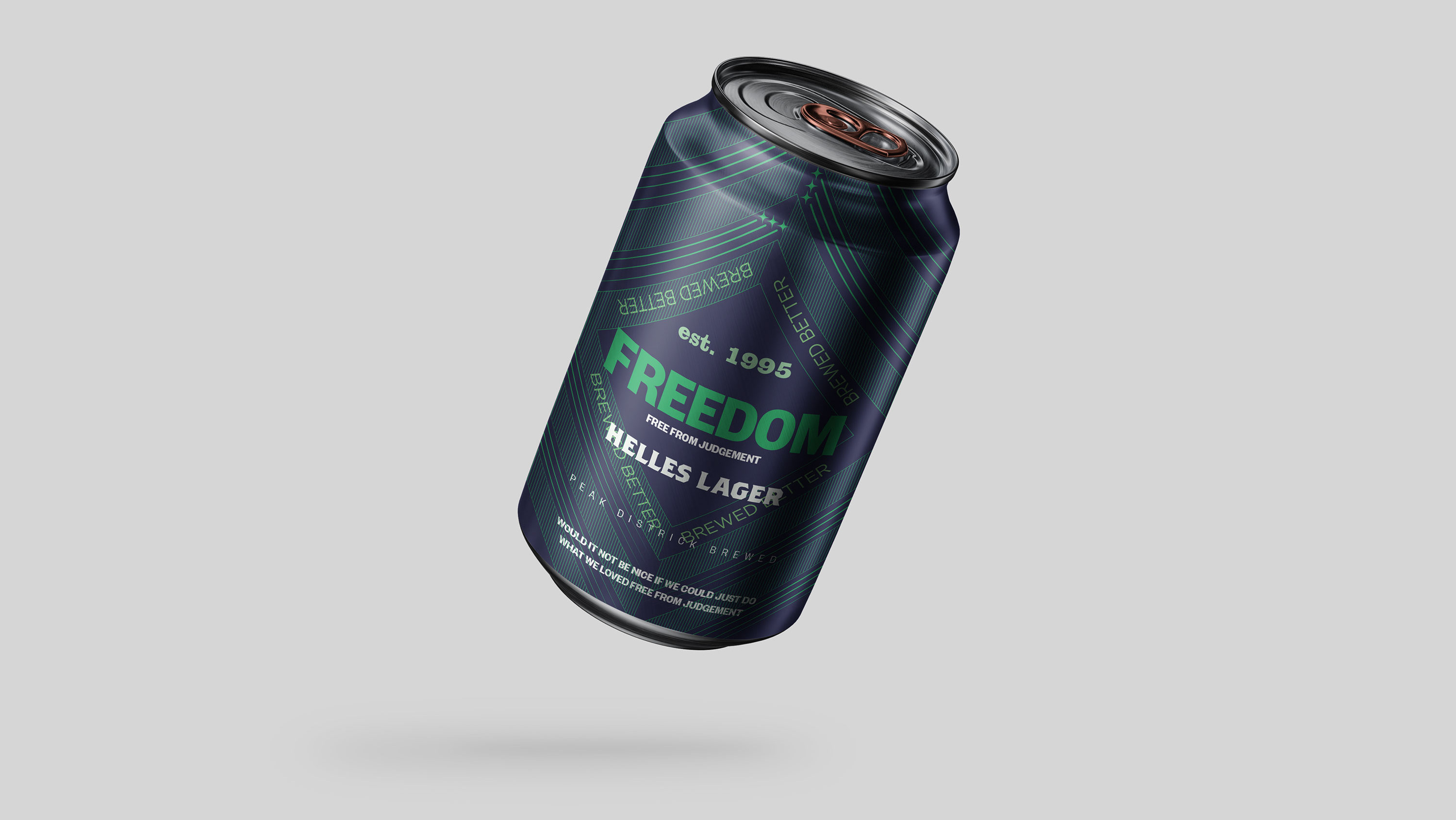
Sold nationwide and known as the original craft beer Freedom wanted to reposition itself, to sit between the craft and premium international beer categories. The design and brand is intended to feel authentic with its use of intricate pattern design paired with bold language, geographic reference and date of establishment. Retaining the essence of the six pointed star through its tessellating negative space, the design is modern whilst purposefully authentic, defining its personality.
Back to Top